MASCOT
Brand Development Case Study: Candy Packaging
Brand longevity and refresh
Three years ago when the largest buyer and seller of Pecans in the US came to us, they were looking to move from wholesale to the retail market and wanted a new package design for their four top selling products. This would be the beginning of their brand journey into retail and the start of a successful client/agency relationship that continues to this day.
The brand back story
MASCOT Pecan Shelling Company is a proud family owned company that was founded in 1955. Over the years they have expanded their operation from just nuts to include a large variety of candies and snacks. They were already selling a line of these products under SCOTT’S, a fundraising division.
They pride themselves on their homemade, small batch, original recipe products, made in the USA, and were clear that this new retail line must reflect their history in the brand graphics and copy.
The Mascot brand evolution
Our first projects
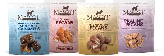
Our initial project was taking their top 4 sellers from wholesale to retail. A package design was created that was centered around their history. It incorporated their existing Scotty dog logo and a historical shot of their first, original storefront location. Differentiating the various flavors through color guaranteed the choices would be evident on the shelf.
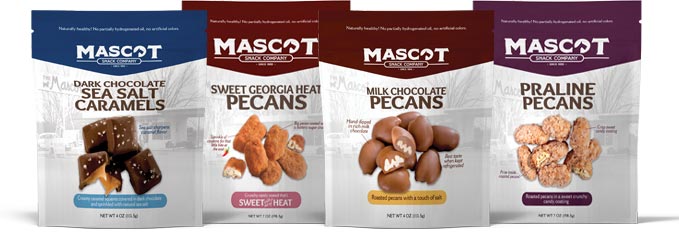
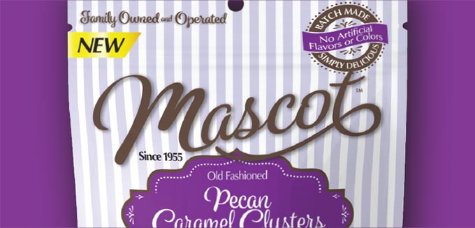
As the brand grew in popularity and their product lines expanded, Catalpha was asked to redesign their packaging again. This involved a logo redesign to maximize the MASCOT name and strengthen their position as a snack company. The Mascot Scotty was simplified and reworked for brand name prominence. The package design also went through a redesign to strengthen brand visibility. Highlighting the breadth of the product line was achieved by the color badge at top of package. These colors create a bold backdrop to pop the brand and help differentiate between product flavors. The color pallet was expanded as new candies and snacks were developed and brought to market.
Today— what’s old is new
Moving forward without forgetting the past
Through successful marketing and brand consistency, MASCOT has seen tremendous growth in the retail snack arena. We have had the opportunity to work closely with the client in evolving the brand through this success in the retail market. It became very apparent that part of the popularity, aside from their unique and substantial product offerings, was Mascot’s family-owned, small batch commitment that has stood the test of time—without shortcuts in quality or consistency.
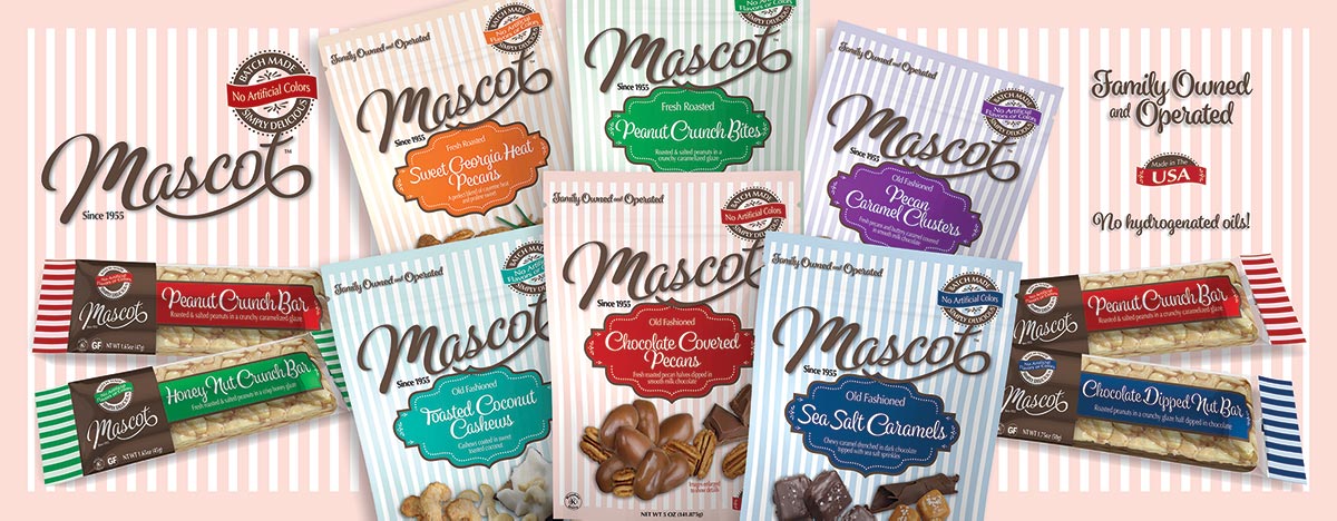
Using the feedback received from their buyers, distributors and marketing team, Catalpha redesigned a new logo and created a striped packaging reminiscent of candy and confection bags from centuries ago that pays homage to their proud history with a nostalgic yet fresh, appealing look.
A look at the branded elements
Not to be missed is the redesigned Mascot logo. Gone is the Scotty dog, a decision that was not taken lightly, but now gives the Mascot name full domination.
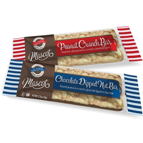
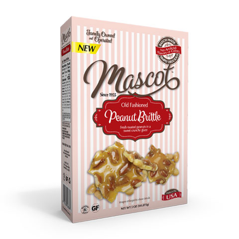
Featuring a modified script font in a signature chocolate brown, the logo flows with a sweep like chocolate drizzle dominating the top of the packages.
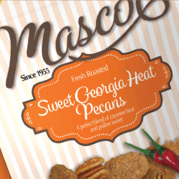
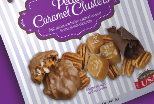
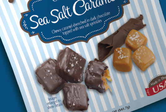
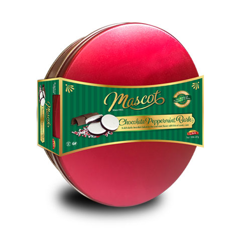
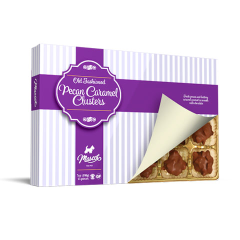
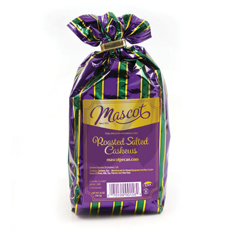
The distinctive striped design gives the packaging a nostalgic look with the color pallet carefully curated to give each product category its own distinct look.
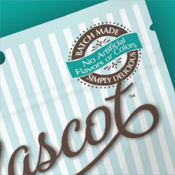
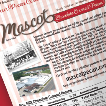
Vintage graphics and text treatments, like the “Batch Made” icon, work to build the brand format of a fresh take on nostalgia. The photo of the original MASCOT building from 1955 remains on the back of the pouch, along with a photo of the current facility—a nod to their 60+ years in business and the 3rd generation management.
Catalpha custom photographed the snacks so the mouthwatering products are front and center – to draw customer in. Key ingredients are incorporated to support the message of small batch and hand made goodness. Not to be missed, the front of package is anchored with “Made in the USA” icon.
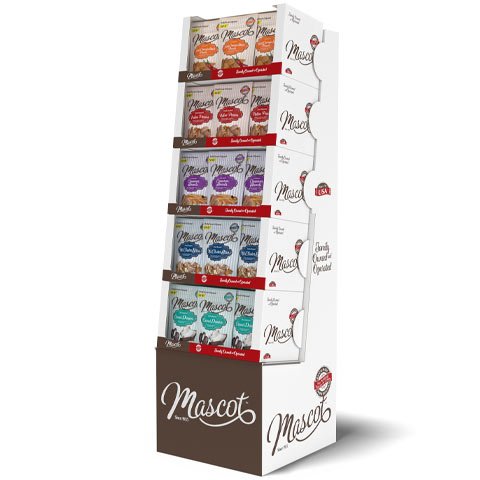
The new brand is being rolled out across Mascot’s entire product line from store displays to seasonal and gift items.
Brand refresh is a major investment – not to be rushed into. It requires a strategy that is founded on facts and a total management buy in and support from you retailers. Without question the brand must know their competitions and the shelf. Catalpha has a proprietary process that helps evaluate individual brands situations and opportunities. If you are considering a revising your brand don’t miss the opportunity of asking our experts advise and insight.
Are you ready?
Contact Catalpha to schedule a risk-free consultation on your next project.
Don’t take our word, listen to our customers…

For the second week in a row all 5 appointment slots on Saturday are booked. Plus I have had some on weekdays. I am almost totally booked for July, August is close. And September is filling out nicely too. I think adding that option was a brilliant idea that has paid off. I think we have a Home run! Pretty exciting!
Donna Meros, Essex Florist, Owner
“This advertising and design agency is great for packaging design, logos, etc. These guys have turned around on a dime for last minute projects and helped our company grow dramatically. Highly Recommended!”
Jackie Pino, Coopersburg Products LLC
Catalpha did a really terrific job on a complete redesign of our retail packaging. Our current retail customers continue to comment to me how eye-catching and attractive the updated art is, and when we’ve shown prospective new customers the new packaging, they totally love it. It’s just really easy to imagine the product jumping off shelves.
George Prior, BBQ Dragon

