Brand Identity at Point of Purchase: Catalpha Helps Black & Decker Develop the Right Image
Chances are you didn’t think too much about why you picked up one item over another the last time you were shopping for power tools. But someone did, and if the tool you chose was from Black & Decker, that someone was Karen Kerski, a Principal with Catalpha Advertising & Design in Towson, Maryland.
“We were given the challenge by Black & Decker to come up with an on-board point of purchase system that had to work on all of their outdoor products, be a strong branding tool with a step-up strategy, as well as educate the consumer and be durable enough to be on display for six months to a year without needing to be replaced,” explains Kerski.
On-board POP means that whatever is used must attach to the tool. A label, for example, is on-board POP. And for Black & Decker, the on-board POP had to work within a broader context.
“We wanted to completely revamp the design of our POP,” says Sara Simonsen, Black & Decker Brand Manager. “Our main objective was to look consistent, to put more emphasis on the Black & Decker brand and have the POP be easier to understand from the consumer standpoint.”
“The project was to create POP that attaches directly to the tool, attracts consumer attention at retail and allows the consumer to comfortably handle the tool,” says Karen. “The solution we proposed had to translate to all possible types of POP such as headers, counter cards, aisle violators, etc. We wanted something unique to Black & Decker that couldn’t be copied outright, with a flexible yet rigid design format. It had to work in every retail environment and for special promotion opportunity. And it had to increase identity for the Black & Decker brand in the store.”
“We got all positive feedback from our retailers. They thought it looked clean and helped the product.” Sara Simonsen, Black & Decker Brand Manager[end-site]
With that big a challenge, where do you begin? Research, which in this case was a shopping trip. Kerski and the Black & Decker team, including Brand and Channel Managers, walked through several stores to get a feel for the varied display issues and opportunities. A major concern that had to be addressed was managing the different needs of the retailers who would be selling the products. Retailers need to eventually sell the display products, so the POP would have to be easily removed with no residue yet hold firmly for an extended period of time. And it had to fit into the retailers’ display space.
Karen and the Catalpha team set to work. They knew from the start they wanted something unique, and a simple label wasn’t going to provide enough space for product information. They wanted the higher-priced items to have POP that reflected the added value, but they wanted everything across all price-points to firmly identify the products as part of the Black & Decker family. After a week of development, Catalpha presented Black & Decker 3 solutions including graphic and production strategy for each concept.
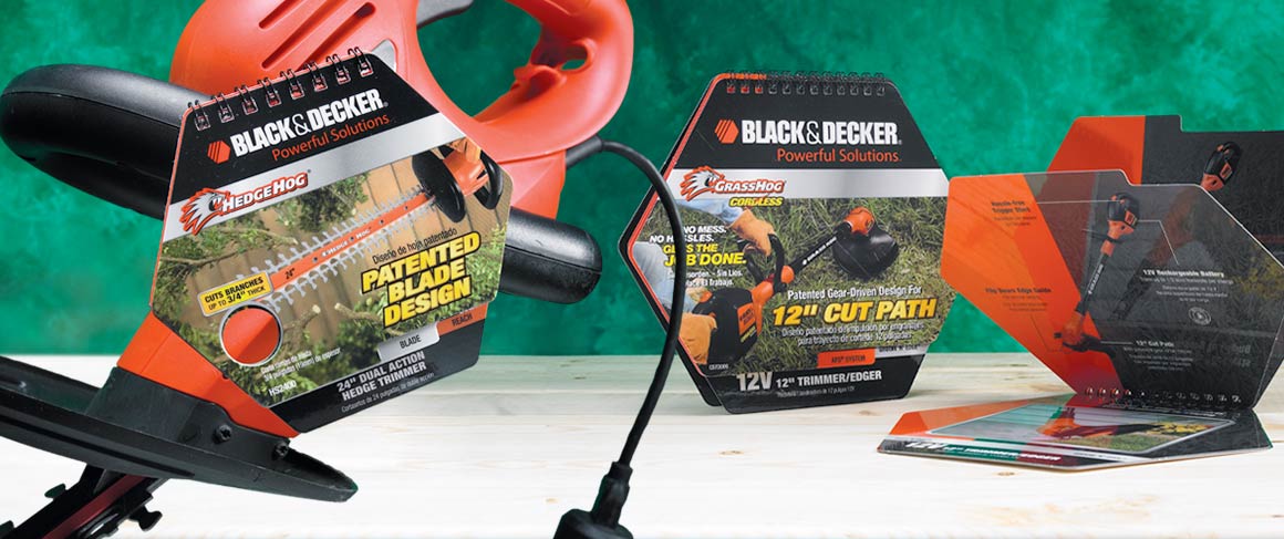
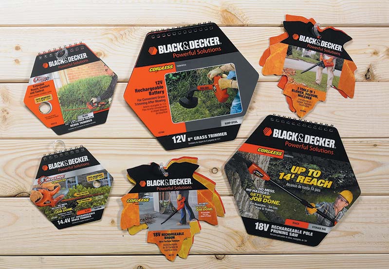
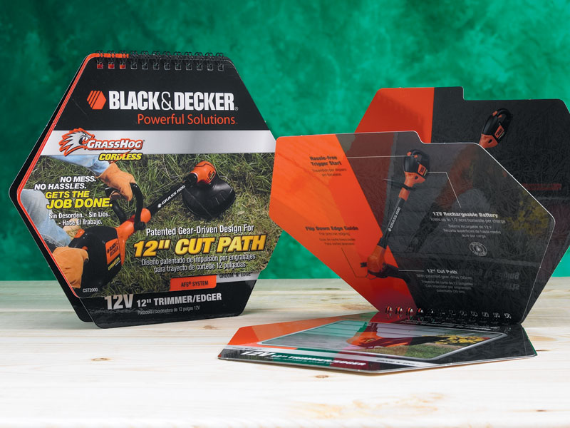
Black & Decker selected the concept that centered on a flipbook. The hex component of the Black & Decker logo is the key to all of the on-board POP.
For the lowest price points, the hex was simple – a basic hangtag with just one benefit clearly spelled out. As you move up the line, the tag becomes more elaborate, turning into a spiral-bound flip-book complete with holograph and detailed benefit points for the most expensive options.
“Catalpha took our existing graphic items and incorporated them well into the POP,” states Tracy Myers, Graphics Project Specialist at Black & Decker. “They used the hex shape very creatively, which is part of our brand strategy, and the flipbook option gave a chance to use more space.”
One of the more creative ideas the Catalpha team developed was the use of actual drill holes for the hedge trimmer tags to provide consumers with a strong visual representation of which product would meet their needs. As Kerski explains, “branch capacity is illustrated by a hole the size of the maximum branch diameter the hedge trimmer can cut. The hole is more dramatic than a picture and more effective. The consumer immediately relates the hole to their trimming needs. Plus, this solution had never before been used by any of the companies to represent cutting capacity, so it would be a unique first for Black & Decker.”
Although the hang tags were elaborate, Catalpha had no concerns about the concept being unworkable. That’s because they make it a point that everything they present to their clients is feasible to produce.
“We know Catalpha’s designs can be executed,” Myers simply states. “They follow the project from start to finish and make sure it can be done.”
The result was a resounding success. “The retailers really liked it,” Simonsen says. “We got all positive feedback from our retailers. They thought it looked clean and helped the product.”
The design industry also found the designs to be winners. Catalpha’s designs for Black & Decker’s Leaf Hang Tag series, Hex Hang Tag series and Mower signs were honored with American Graphic Design Awards.
While Kerski is pleased the team’s solution was so successful, she’s not surprised. “A truly successful solution isn’t just targeted copy and graphics. Determining that you can produce your idea is an integral part of our creative process,” she explains. “Proposing a winning solution means considering the environment it will be displayed in and/or what it is competing with for attention. Solving a client’s marketing problem includes knowing that you can produce a design cost-effectively that speaks to the right audience, answering their needs and concerns, and gets the sale or response needed. This is as important as the visuals and copy. Simply put, the solution needs to work. Ours do.”
Call Today – 888-337-0066 Or fill out this form for a quick estimate on your next display project.
100% Privacy. I will never spam you!


