GENIUS GEMS
Packaging Design Case Study: Educational Toy
It began with one person who made some of the best tasting toffee ever. That quickly became a local favorite, and just as quickly grew to become a national brand.
The Genius Gems Back Story
Genius Gems, founded in 2013, excels to enrich kids lives by learning through play. With on-site camps and labs and classes, kids of all ages gain experience with hands-on creativity, interacting with peers, critical thinking, and having fun. Their STEM and STEAM-focused curriculum was developed by an experienced educator. At the center of these activities?— magnetic tiles!
Genius Gems has designed and produced one-of a kind, unique magnetic tiles that magnetically adhere to all brands of magnetic building tiles. These tiles feature printed designs to inspire magnetic creations, as well as interactive adhesive tile sets that you design and embellish. They have become such a hit at the Genius Gems campus, the owners decided to package select sets to offer for sale.
Designing Branded Packaging to Appeal to Kids of All Ages
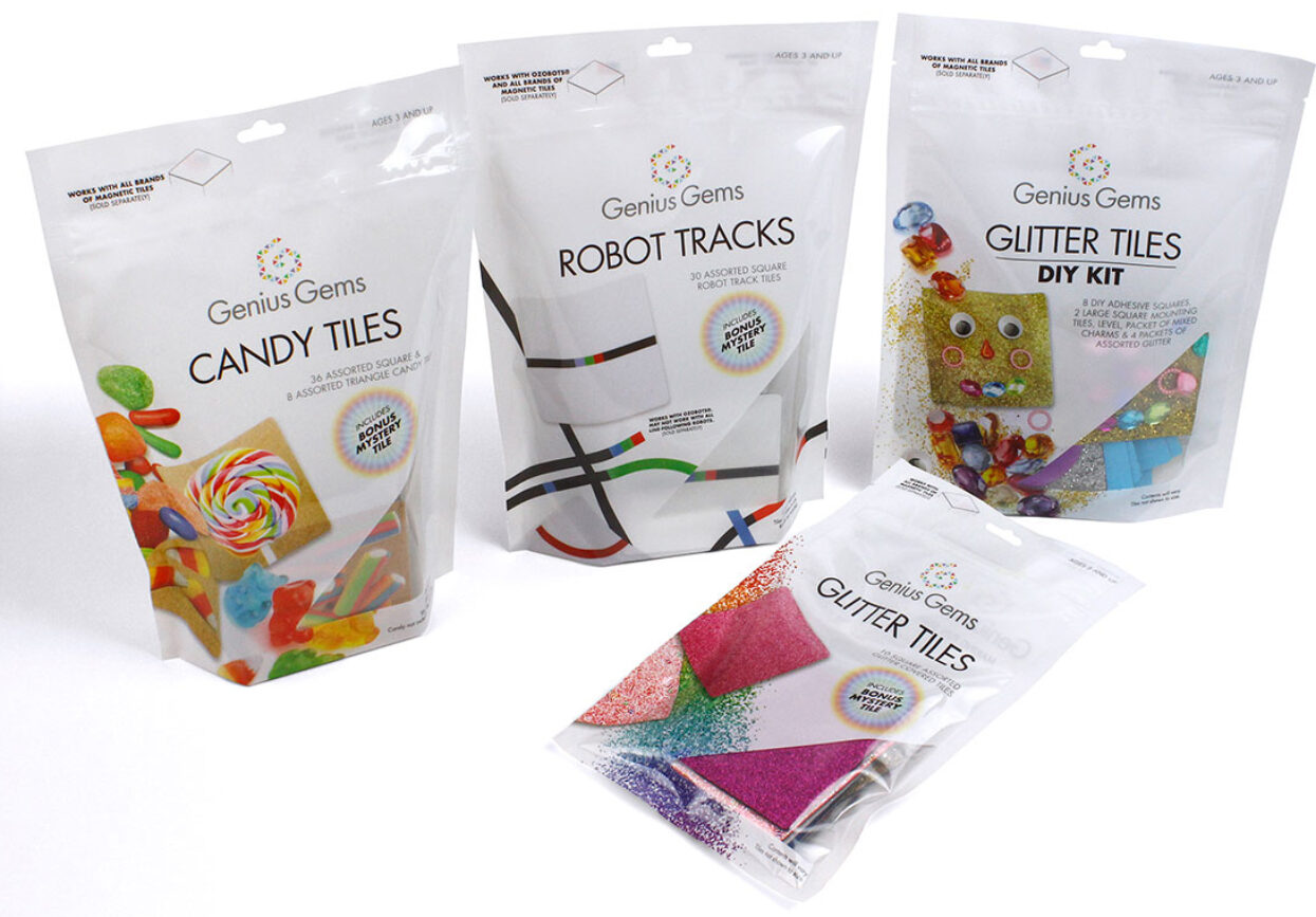
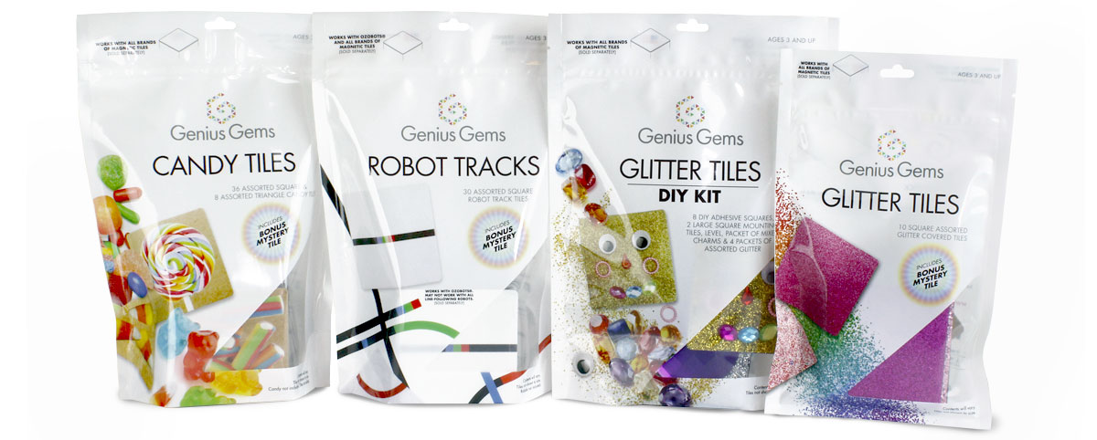
A series of bold, cleanly branded pouches were designed for each of the tile sets. With their educational, STEM focused purpose and diverse target audience covering kids of all ages, a brand concept was developed that is engaging without looking juvenile.
Clean, bold, graphics and visuals placed against a white background gives the brand a sophisticated, eye-catching appeal, elevating it above a simple toy and reflect their higher purpose.
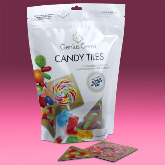
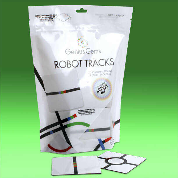
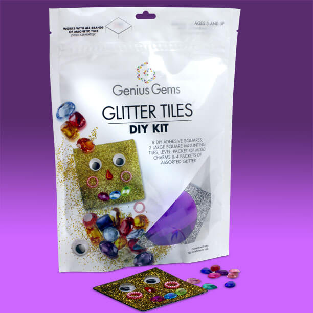
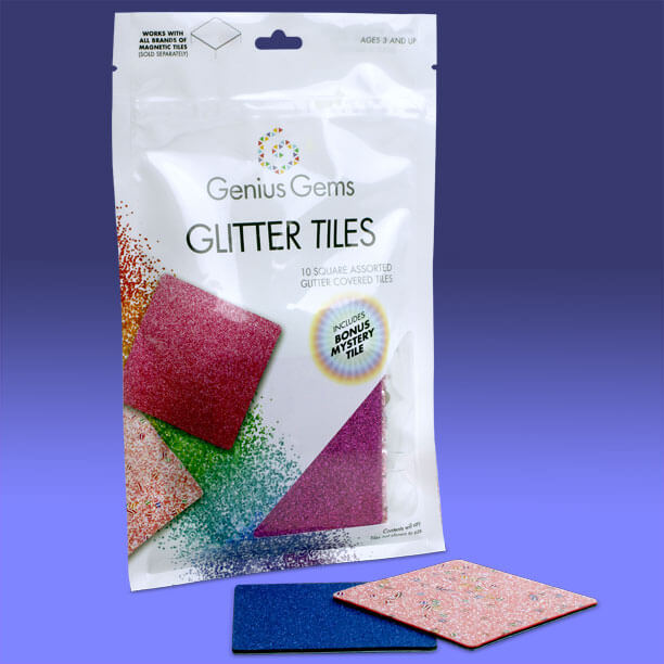
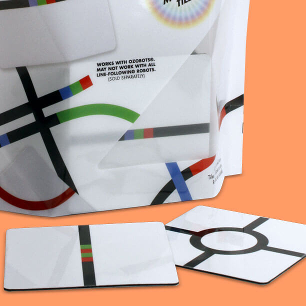
The products are packaged in resealable pouches with a window on the front to allow the actual tiles and their size and quality to be seen, adding a unique look to the brand. The use of stand-up pouches for the larger sets allowed flexibility for the varied amount of product, while the ability to reseal the packages allowed kids to keep tile sets organized after play.
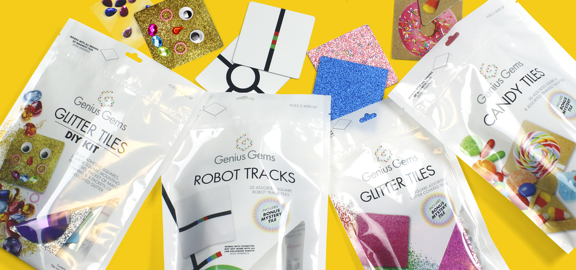
Brand Elements
Bold, colorful photography was custom shot by Catalpha to capture the attention of the young audience. The clean white background and randomly placed elements lend visual excitement and mimics the act of play.
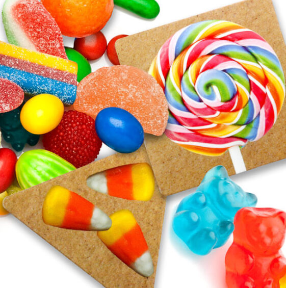
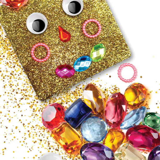
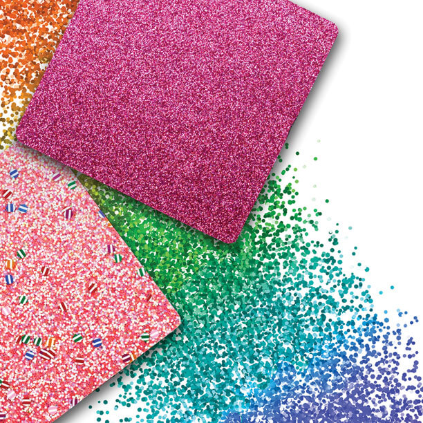
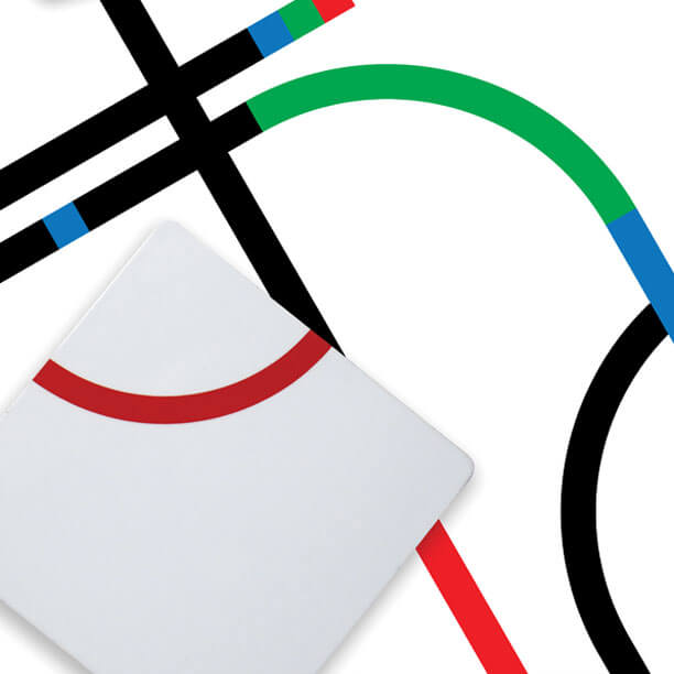
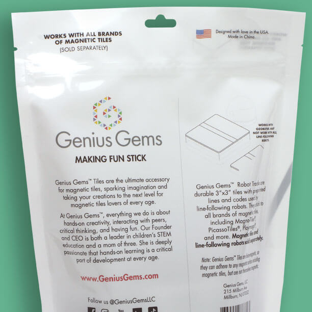
A ‘Bonus Mystery Tile’ icon was designed and cleverly used to cross sell a tile of a different sort in some of the pouches. The pouch backs featured the Genius Gems brand story, descriptive text, social media links and clean line art.
Moving Forward
Branding is not a one-and-done event. Thought and attention needs to be given in developing and initiating a brand’s visual persona. Anticipating a brand’s forward direction and path at the onset of brand development allows for creating a visual look that is flexible, dynamic and lasting. With its clean, bold, easy to read branded format the Genius Gems Brand continues to grow, with new products and offerings.
Are you ready?
Contact Catalpha to schedule a risk-free consultation on your next project.
Don’t take our word, listen to our customers…
“This advertising and design agency is great for packaging design, logos, etc. These guys have turned around on a dime for last minute projects and helped our company grow dramatically. Highly Recommended!”
Jackie Pino, Coopersburg Products LLC

Thanks for all the support you’ve given us on this clam shell project for the oil valve. You all truly do an amazing job!
Mike, Valvomax

I wanted to inform you I’ve received the shipment and the boxes look great! Thank you for making the reorder easy and getting them to me quick.
Anthony Daraban, Luvit LLC

